
Last Updated on July 9, 2026
By Florian Smeritschnig, former McKinsey Senior Consultant · Updated June 2026
To interpret a chart in a case interview, do not read the numbers back. The interviewer already knows what the chart says; they slid it across the table to watch you find the 2 to 4 data points that matter and turn them into a “so what” that moves the case forward. The method is the same on every exhibit: restate why the chart exists, read its title, axes, and units, take 30 to 60 seconds to think, then lead with the key insights and their business implication, eventually propose next steps. Interviewers score the insight, not your reading speed.
After spending five years at McKinsey, then running more than 2,200 mock cases and scoring this exact moment from the other side of the table, I can tell you what separates the candidates who crack chart interpretation from the ones who freeze. It is not math speed or raw intelligence. It is a repeatable method, run the same way on a simple bar chart or a waterfall stacked next to a scatter plot. This guide gives you that method, the chart types you will face, the mistakes that quietly sink candidates, and a worked example from a real profitability case.
Key Takeaways
- Case interview charts are not reading tests. The interviewer grades whether you isolate the few data points that matter and translate them into a “so what.”
- Run a 4-step method on every exhibit: 1. restate purpose & describe, 2. clarify, 3. think, 4. then share insights top-down, explain the so-what, propose next steps.
- The biggest differentiator is pausing 30 to 60 seconds before speaking. Candidates who rush read numbers; candidates who think deliver insights.
- Every chart type has a native job: bars compare, lines show trends, waterfalls decompose a change, scatters reveal correlation. Match the read to the type.
- The “so what” is the scoring moment. A number is an input, not an answer. Connect it to the case objective and a next step.
Why interpreting charts is a separate case interview skill
Chart interpretation tests something different from structuring or case math. It tests business judgment under time pressure: can you look at a dense visual and decide, in under a minute, which two or three data points actually matter for the problem in front of you.
This is exactly what a junior consultant does on a real engagement. When a partner drops a working paper on your desk at 9 p.m., they expect you to absorb it, flag the key insight, and propose what the team should do differently tomorrow, not read it back. Firms know most candidates have never trained this particular skill. That is why exhibits are one of the most discriminating parts of a modern case interview, especially at MBB, where interviews almost always include at least one exhibit, and also during digital assessments like the McKinsey Solve Game.
What interviewers actually score on an exhibit
Before the method, know what the interviewer is watching. Grading this moment every day against an internal rubric, here is what drives the score:
- Relevance: did you pick the 2 to 4 data points that matter for the objective, or fixate on noise?
- Quality of the “so what”: did you translate a number into a (business) implication, or stop at describing it?
- Communication structure: did the insight come first, or was the punchline buried mid-paragraph?
- Hypothesis formation: did you use the chart to update your view of the case, or did it sit disconnected? Did you propose relevant next steps?
- Composure and pace: did you pause, think, then speak, or start narrating the second the exhibit appeared?
Notice that nothing here rewards reading speed. Three of the five reward taking time to think. Candidates who internalize that before their first interview have a structural edge over the ones who treat the exhibit as a race.
The 4-Step Method for Case Interview Charts
Run this sequence on every exhibit. It works on a simple bar chart and it works on a waterfall combined with a scatter plot. After twenty to thirty reps, it becomes automatic.
Step 1: Restate the Analysis Purpose and Describe What You See
Before you look at the data, say out loud why the exhibit exists in this case. “We are trying to identify which product segment is driving the profit decline, and this chart appears to break revenue down by segment.” This takes ten seconds and does three things: it confirms you remember the case objective, it primes your brain to look for relevant patterns, and it signals to the interviewer that you interpret data with purpose, not curiosity.
Read the chart’s architecture out loud in one or two sentences: title, axes, units, time period, legend, and any footnotes. “This is a stacked bar chart showing revenue in millions of euros from 2021 to 2025, split across four product lines, with a footnote noting that 2025 is an estimate.”
Do this fast. You are not reading insights yet, you are grounding yourself and signaling to the interviewer that you are reading carefully. Candidates who skip this step routinely misread units (thousands vs. millions) or miss the footnote that reframes the entire chart.
Step 2: Clarify Anything Unclear
If a label is ambiguous, a unit is unfamiliar, or a category is not defined, ask. “Quick clarification: does ‘Product C’ include the subscription business, or is that broken out separately?” Interviewers expect this. Guessing and being wrong is worse than asking and being right.
Step 3: Ask for 30 to 60 Seconds of Thinking Time
This is the single most important step and the one most candidates skip. Ask for thinking time explicitly: “Can I take a minute to review this?” Then actually use it. Silently.
In those 60 seconds you need to: scan for the 2-4 relevant data points, separate them from noise, form a hypothesis about what the data implies and what next steps should look like, and decide which single insight to lead with. Candidates who skip this step start talking immediately and end up narrating what they see in real time, which produces rambling, unstructured output.
After coaching 700+ candidates into MBB offers, I can tell you that this pause is the single biggest differentiator between successful and unsuccessful candidates. The ones who pause sound like consultants. The ones who rush sound like nervous students (and usually miss important items or a clear direction forward).
Step 4: Share the Key Insights, Explain the “So-What” and Next Steps (Top-Down)
First, the insights
Lead with the single most important insight, then stack supporting points behind it. Use the phrasing of a senior consultant, not a student reading off a page:
- “The headline from this chart is that Product B has grown 40% while every other line is flat or declining.”
- “Supporting this, Product B’s share of revenue has moved from 15% to 32% over four years.”
- “And the footnote suggests the 2025 estimate assumes continued Product B momentum, which may be a generous assumption.”
Three insights, top-down, each tied to a specific data point. No reading back numbers that do not support the story.
Then, explain the “So-What”
This is where offers are won and lost. Every insight needs a business implication. A raw number is not an answer, it is an input. The interviewer is grading whether you can connect the chart back to the case objective:
“If Product B is the only growth engine and its share has doubled, the profit decline is not a revenue problem; it is likely a mix shift or cost structure issue on the other three products. That redirects our analysis.”
The “so-what” must be specific, case-relevant, and forward-moving. If you catch yourself saying “this is interesting because it shows that revenue grew,” you have not yet reached a so-what. Push one level deeper.
Finally, propose next steps
Close the loop by proposing what you would analyze next. “Given what the chart shows, I would want to look at gross margin by product line to confirm whether the mix shift to Product B is actually improving profitability or masking a margin compression.” This demonstrates that you can drive the case forward rather than waiting for the interviewer to lead.

The 4-step method in practice: worked example
Let me show you the method on a real exhibit.
The case is a classic profitability case: a European dairy company has seen operating margin drop from 12% to 7% over four years, and the interviewer hands you a waterfall chart decomposing the 5-point margin decline.
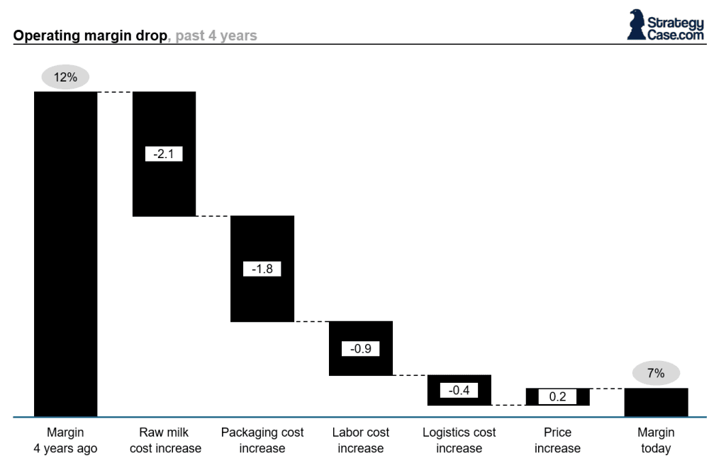
The waterfall shows: -2.1 points from raw milk cost increases, -1.8 points from packaging cost increases, -0.9 points from labor cost increases, -0.4 points from logistics, +0.2 points from price increases.
A weak candidate says: “Okay, so raw milk is down 2.1, packaging is 1.8, labor is 0.9, logistics is 0.4, and price is up 0.2. So costs are up across the board and prices are only slightly up.”
That is reading, not interpreting. Zero insight.
A strong candidate runs the 4-step method:
“So the objective is to understand the 5-point margin decline. This waterfall decomposes the decline into cost components and a price offset in percentage points of margin [Step 1: Restate and Describe]. Can I take 60 seconds? [Step 3: Thinking time] (note that the candidate skipped the clarification step, which is fine when everything is clear).
The headline insight is that input costs, raw milk and packaging, explain nearly 80% of the margin decline. Second, price increases offset only 4% of the cost increase, suggesting the company has very limited pricing power. Third, labor and logistics are comparatively small, which tells me operational efficiency is not the story here [Step 4: Insights].
The so-what is that this is a commodity input exposure problem disguised as a margin problem. Hedging programs, supplier contract renegotiation, or product mix shifts toward higher-margin SKUs are the levers, not operational efficiency [Step 4: Implications].
Next, I would want to see whether competitors have faced the same input cost pressure, because if they have and their margins held, the problem is our pricing power, not the inputs themselves [Step 4: Next step].”
Same data. Completely different answer. The second candidate gets the callback.
Chart types and how to read each one
Every chart type has a native job. Match the read to the type and the insight is usually hiding in plain sight.
| Chart type | Its native job | What to look for |
|---|---|---|
| Bar (incl. stacked, 100%, clustered) | Compare categories or composition | Largest/smallest bars, surprising rank order, a category breaking the pattern |
| Line | Show trends over time | Inflection points, diverging lines, the steepest slope, a ranking reversal |
| Pie | Proportion at one point in time | The dominant slice; concentration (2 slices own 80%) vs fragmentation |
| Scatter / bubble | Relationship between variables | Direction and tightness of correlation, outliers, clusters (not causation) |
| Waterfall | Decompose a change (A to B) | The 2 to 3 components that explain most of the move; offsets |
| Area / spider / flow | Cumulative, multivariate, or process | Cumulative shifts, capability gaps, bottlenecks in a sequence |
| Data tables | Dense numbers (written cases) | Largest values, row-by-row rate of change, fast ratios (revenue per customer) |

For structured theory and reps on each pattern under time pressure, StrategyCase’s chart interpretation course and drills work through dozens of real exhibit types with timed scoring.
Triage every chart: relevant, irrelevant, misleading
Reading a chart mechanically is the easy part. The harder skill is triage. Every exhibit holds three kinds of data points, and sorting them is what makes the “so what” possible:
- Relevant: outliers, unexpected patterns, or anything tied to your hypothesis. Lead with these.
- Irrelevant: minor variation that supports no case-relevant conclusion (a 2% wobble on a non-core segment). This is what weak candidates read back.
- Misleading: decoys. A footnote that holds the real story, a y-axis that does not start at zero, a vague legend. Interviewers sometimes plant these on purpose. Flag them.
Your job in those 60 seconds of thinking time is to drop every data point into one of these three buckets, then lead with the relevant, ignore the irrelevant, and name the misleading.
The five insight patterns hiding in a case interview chart
1. Comparisons
How does X compare to Y? Internal vs. external, our firm vs. competitor, our new product vs. our legacy portfolio, scenarios. Most cases reward the candidate who frames findings as comparisons rather than absolutes.
2. Segmentation
Does the aggregate hide a story at the segment level? A flat revenue line at the total level often contains two offsetting trends underneath. Candidates who look for the story beneath the aggregate consistently out-perform (e.g., breakdown of financials, business segments, processes).
3. Relationships and correlations
Does variable A move with variable B? Scatter plots and multi-line time series reward candidates who can spot correlation, comment on direction and tightness, and flag the standard warning that correlation is not causation.
4. Trends and changes over time
Is the line going up, down, or sideways? More importantly: is the rate of change accelerating, decelerating, or reversing? A trend reversal or a significant break in an established pattern is almost always case-relevant.
5. Outliers and unexpected patterns
The single data point that does not fit. The segment whose growth is 10x the rest. The year where the pattern breaks. These are almost never accidental in case interviews. If you see an outlier, it is part of the answer.
Learn to spot patterns quickly, especially across multiple charts. The most valuable insights often come from combining data, not analyzing charts in isolation. For example, checkout speed and wait times cannot be explained by the number of cashier desks alone. You need to relate it to store size, customer volume, and basket size to uncover the real driver.
The mistakes that quietly sink candidates
After thousands of mock cases, the same failures repeat. Avoid these and you already beat most candidates.
Mistake 1: Assisted reading of every data point
“So revenue in 2021 was €120M, in 2022 it was €135M, in 2023 it was €142M, in 2024 it was €148M, and in 2025 it looks like €155M.”
This is the single most common failure mode. Candidates read every number hoping that the act of reading will generate an insight. It will not. The interviewer already knows the numbers. You are wasting your speaking time on information transfer that adds zero value.
Mistake 2: Stopping at the data instead of the So-What
“So Product B has grown from 15% of revenue to 32%.”
Okay, and? What does that mean for the case? A data point without a “so-what” is not an answer. This is the difference between a strong pass and a reject at every MBB firm.
Mistake 3: Analyzing the chart without an objective
Diving into data without a clear goal leads to aimless observations. Strong candidates anchor every chart in the case objective and focus only on insights that move the problem forward.
Mistake 4: Unclear data context
Failing to clarify scope, timeframe, or source leads to flawed conclusions. Always establish what the data represents before interpreting it.
Mistake 5: Speaking before thinking
Candidates start narrating the moment the exhibit appears on the table. The brain cannot simultaneously read a complex chart and produce a structured answer. Pause. Think silently. Then speak.
Mistake 6: Misinterpreting units or magnitudes
Thousands vs. millions. Local currency vs. US dollars. Percentage points vs. percent change. Index values vs. absolute values. Candidates who skim the axes burn their own credibility in ten seconds and rarely recover within the case.
Mistake 7: Ignoring footnotes and source lines
Footnotes exist because the chart creator needed to warn you about something. Sampling methodology, estimates vs. actuals, excluded categories, a change in accounting treatment. Read every footnote before you form your insight.
Mistake 8: Building the story without a hypothesis
If you read a chart without a prior hypothesis about what you expect to see, you will latch onto whatever pattern your eyes notice first, which is often not the relevant one. Always form a quick hypothesis before Step 3 thinking time (“I expect Product B to be the issue given what we discussed earlier”), then use the chart to confirm or disprove it.
Mistake 9: Lengthy calculations
Getting lost in detailed math instead of focusing on visible insights slows you down. Prioritize high-impact observations over unnecessary calculations. Candidates often waste time by going into detailed calculations where a qualitative observational analysis would suffice.
Mistake 10: Ignoring correlations and dependencies
Missing relationships between variables limits the depth of your analysis. Look for patterns, trends, and cause-and-effect links.
Mistake 11: Overlooking hidden insights
Focusing only on obvious data points means missing deeper insights. Combine data sources and compare segments to uncover what others miss.
Mistake 12: Treating every chart as a fresh puzzle
Charts connect to the broader case. A candidate who analyzes each exhibit in isolation misses the thread. Good candidates explicitly tie each chart back to what was established in earlier exhibits and what remains unanswered in the case objective.
Mistake 13: Chaotic presentation
Presenting insights without structure makes it hard to follow your thinking. Use clear signposting and a logical flow to guide the interviewer.
Charts in digital assessments (Solve, Casey, SOVA)
The skill is the same; the format changes. McKinsey Solve, BCG’s Casey test, and Bain’s SOVA all test chart and data interpretation in a more or less direct format, scored by an algorithm rather than a person. Three things differ:
- Pace is fixed. You cannot ask for 60 seconds on a timer, so you compress steps 1 to 4 into a few seconds of silent reading.
- Communication does not count. The algorithm grades the right answer, not your top-down delivery, which shifts the emphasis to pure pattern recognition.
- Distractors are engineered. Misleading data points are deliberate traps, not incidental. The candidates who beat these still run the full method mentally, just faster.
How to practice chart interpretation in two weeks
Two weeks of focused reps move most candidates from average to strong:
- Collect real charts from case banks. Our case interview examples library has a large bank of McKinsey, BCG, Bain and other top firms’ exhibits. For a more exhaustive and paid offering, see below.
- Run the 4-step method out loud, timed, and record yourself. Listen for whether you lead with insights or descriptions, then discuss the so-what and next steps. Add real business charts in Harvard Business Review, the Economist or other sources to build judgment and flexibility.
- Add a partner who asks follow-up “so what?” questions until you run out of depth. That is where the skill compounds.
For timed drills with feedback, our chart interpretation course and drills includes relevant theory and dozens of realistic MBB-style exhibit exercises, and 1-on-1 coaching gives you direct feedback on your delivery.
FAQ: Case interview charts
How long should I spend on a case interview chart?
Plan for 4-5 minutes total: 60 seconds to restate and describe, 60 seconds to ask questions, up to 60 seconds of silent thinking, and 60-90 seconds to deliver insights, implications, and next steps. Spending longer than that signals that you are struggling. Spending less signals that you are rushing.
Do I need to do mental math on charts?
Sometimes. You should be able to do percentage change, growth rate, and simple ratios in your head. For heavier math, ask whether the interviewer wants a rough estimate or a precise number, then work on paper. The case interview math guide covers the calculation patterns that show up in exhibits.
What if I genuinely can’t see an insight in the chart?
First, check the footnote and the title again. Second, compare what the chart shows to what you expected before seeing it. The gap between expectation and reality is often the insight. Third, remember why you have asked for the chart in the first place (usually to analyze a certain area of your case interview framework). Fourth, if you still cannot find anything, say so honestly and ask the interviewer for guidance. Bluffing fails at MBB firms every time.
How do I handle a chart type I have never seen?
Fall back on the architecture: title, axes, units, legend, footnote. The format may be unfamiliar but the reading skill is the same. Run steps 1 to 4 slowly and ask for clarification rather than pretending you recognize it.
Can I get better at chart reading without a coach?
Yes, with the right protocol. Solo practice works if you record yourself and review honestly. Coach feedback compresses the timeline because a coach can point out the specific weakness in your “so-what” faster than self-review. If you are preparing for a high-stakes interview inside four weeks, coach feedback is usually worth the investment.
Related guides
- The complete case interview guide: how exhibit reading fits the full skill set
- How to be MECE: the structuring that tells you what to look for
- Case interview frameworks: building the structure your exhibits test
- Brainstorming in a case interview: the other half of structured creativity
- What makes candidates succeed: the habits behind case interview offers
- Case interview feedback sheet: download a free case interview scoring sheet for your practice
Final word
Case interview charts reward one skill above all: the ability to pause, isolate the 2 to 4 data points that matter, and turn them into a “so what” that moves the case forward. Candidates who fail treat the exhibit as a reading exercise. Candidates who win treat it as a structured sprint: restate, describe, clarify, think, deliver top-down, explain the implication, propose the next step.
Run the 4-step method on every exhibit in practice until it is automatic. Start with StrategyCase’s Case Interview Academy to drill exhibit interpretation alongside structuring and math, and you will walk in sounding like a consultant instead of a candidate. The interview is tough, but this skill is learnable.
About the author: Florian Smeritschnig is a former McKinsey Senior Consultant and the founder of StrategyCase. He spent five years at the firm, and has since run more than 2,200 mock case interviews and coached hundreds of candidates into McKinsey, BCG, Bain, and other top firms.

